Element Types in the Contao CMS
As a Content Management System (CMS) application, Contao allows a wide variety of elements that can be displayed on the website. There five main groups for the elements: Text elements, Link elements, File elements, Media elements, and Include elements. The following article explains each type of element that can be used within the articles for the Contao CMS.
Defining the Element Types in the Contao CMS
In order to add different elements for articles, you will need to be in the ADD NEW ELEMENT form described in Creating New Content Elements in the Contao CMS. The selection can be made in the Element Type drop-down menu located at the top of the form.
When you click on the ELEMENT TYPE field, you will see a drop-down menu showing the different element types that can be used. Here's a table summarizing the selectable types:
| Text Elements | Link Elements | Media Elements | File Elements | Include elements |
|---|---|---|---|---|
| Headline | Hyperlink | Image | Download | Article |
| Text | Top link | Gallery | Downloads | Content Element |
| HTML | Video/Audio | Form | ||
| List | YouTube | Module | ||
| Table | Article Teaser | |||
| Accordion | Comments | |||
| Code |
Each of the element types are described below:
TEXT ELEMENTS
The following descriptions explain or show the different text elements that are available in the Contao CMS.
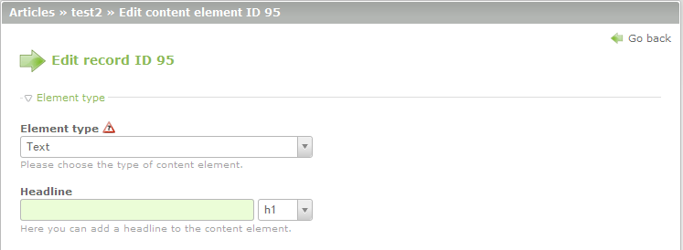
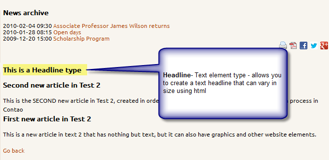
Headline - create text used to headline a group of elements for organizational purposes
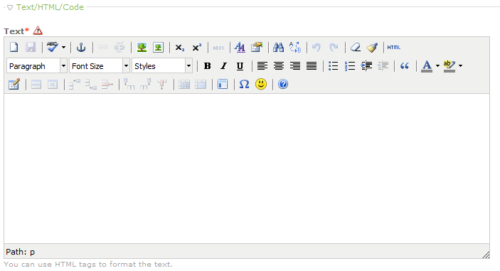
Text - allows you to add text to the element using the text editor as per the screenshot below:
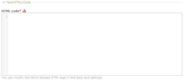
HTML - Allows you to add HTML code for the content through a code editor. Each line is numbered. The HTML Editor interface is shown below:
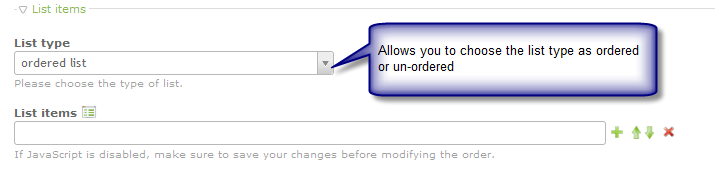
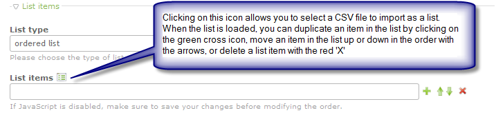
List - lets you quickly create lists either by typing them in directly at the Contao interface or by importing CSV files. Here are 3 screenshots explaining the different options available:
Ordered/Unordered List - Click on the drop-menu to select the menu type to be created
Import CSV File - click on the icon to the right of "List items" in order to import a CSV file to create the list
Create Listed items - based on the LIST TYPE defined, manually create a list by clicking on the green plus sign to add another list item. Use the arrows to move the list items up or down. And click on the red 'X' to delete a list item.
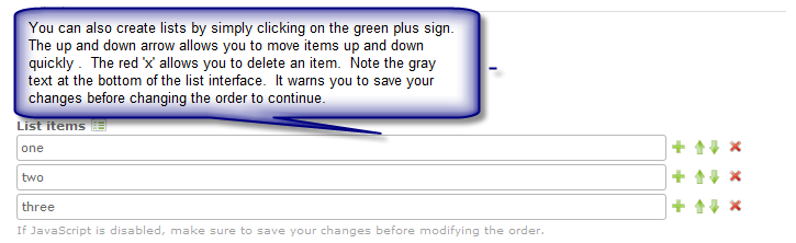
Table - The table type element lets you create a table. Each item in the table section is defined below:
Table items
Create Table items allows you to create each row/column in a table, then maneuver the rows and cells with the directional arrows. Here's a short table summarizing the different icons:
 |
Import file icon - allows you to import a CSV file as a list |
 |
Allows you to increase or decrease the table cel sizes |
 |
Allows you to the row or column that you have selected |
 |
Allows you to move rows up or down the columns |
 |
Allows you to move columns left or right |
 |
Allows you to delete |
The table items section lets you manually create a table. Here's an example how it could look:
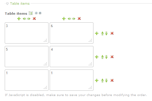
Table Configuration - Includes the following options:
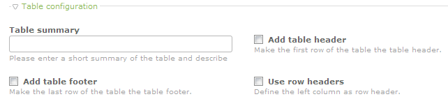
For clarity, the items depicted in the graphic above are summarized in the table below:
| Table Summary | Create a short summary describing the table |
|---|---|
| Add table footer | Makes a row at the bottom of the table for information |
| Add table header | Adds a first row to the table for a header |
| Use Row headers | Defines the left column as a row header |
Sorting Options - check box to make the table sortable (requires Javascript and a table header)
Accordion - allows you to create text elements that you can then click to collapse or expand. When the accordion option is selected, an operation mode option appears and you can select from Wrapper start, Wrapper stop, and Single element. The Wrapper start and Wrapper stop options are used to to mark the beginning and end of several elements (the collapsible area is know as the accordion pane). You can then click on the section and it will collapse (like an accordion) or expand to show the contents in between the start and stop sections. The Single Element option allows you set a single element to collapse and then re-display as though it were a text element in an accordion pane.
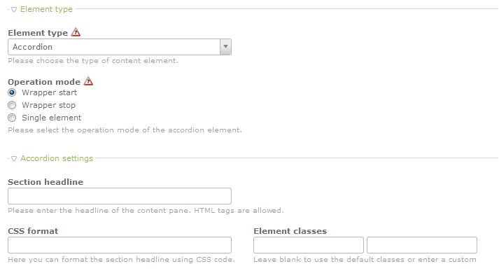
Accordion settings - this section allows you to enter a headline for the content pane. As per the gray description text, you can use HTML tags for the Section Headline. There is also a CSS format field that allows you to format the section headline. Element Classes can also be set using the fields provided. To use the default, leave the fields blank.
Code - The last text element type listed is the CODE type. You can add code as text elements for your web pages, but highlight the syntax using the options provided:
Syntax highlighting - the Contao interfaces a large variety of scripting languages that you can choose.
Configuration - Provides the option to configure the syntax highlighter.
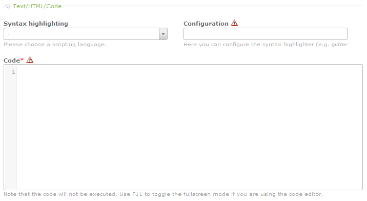
As per the note above in the screenshot, it is important to note that the code will not be executed. The code editor is a quick and helpful option to post code, but it also highlights the code based on large array of script types that you can select in the Syntax highlighting menu.
Link Elements
Hyperlink - allows you to create an element for the article based on a link. The link section includes the following: Hyperlink settings and Image link settings. The screenshot below displays the options that appear when the hyperlink element is selected:
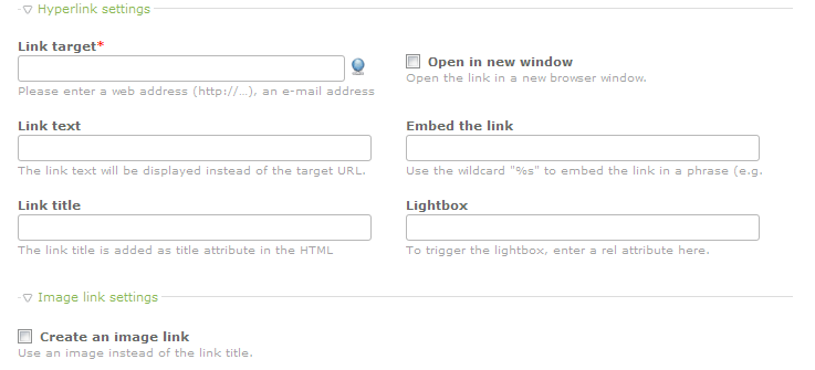
Here is a table summarizing the link options:
| Link target | the hyperlink (url or email address) |
|---|---|
| Link text | text for the link that will show instead of the actual link target address |
| Link title | specified as a title in HTML |
| Open in a new window | Click the checkbox to cause the link to open in a new window |
| Embed the link | Uses a wildcard "%s" to embed the link into a phrase. |
| Lightbox | Add a Rel attribute to trigger the lightbox |
| Create an image link | Uses a specified image instae of the link title |
Top link - creates a link that jumps to the top of the page. The only option that can be set for this element type is the Link text which would be displayed instead of the URL, if set.
Media Elements
As per the name, media element includes the different types of media that might displayed including images, audio, and video. Each media option has different settings. The following options are broken down per section for the media element type discussed.
Images - You can specify an image using the Source File option (mandatory to save the Image type) under the files and folders section. The following screenshot summarizes the options for images:
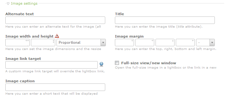
| Alternate text | Text that describes the image |
|---|---|
| Image width and height | allows you set the image dimensions and the way it will resize |
| Image link target | image link which overrides the lightbox link |
| Image caption | text displayed when image is shown |
| Title | title attribute for the image |
| Image margin | margin for the image |
| Full-size view/new window | Opens the image in full-size or the link in a new window |
Gallery - Allows you create an image gallery that uses a template (gallery_default is the default gallery setting for a Contao installation). The following screenshot displays the options available for a Gallery:
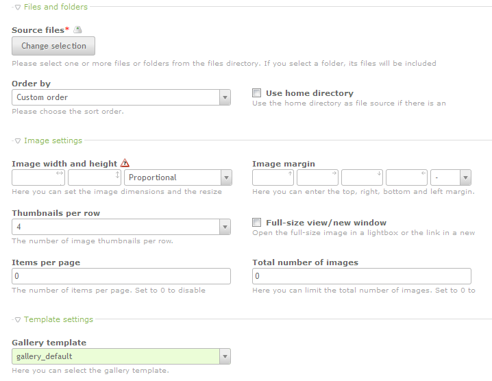
The following table summarizes and describes each option available for the Gallery:
| Source files | allows you to select a file or folder containing multiple images |
|---|---|
| Order by | allows you to determine how sort the files using a custom sort order, file name, date or random |
| Use home directory | sets the home directory as the file source, but only if there is an authorized user logged in |
| Image width and height | sets the image dimensions and also the resize method |
| Thumbnails per row | allows up to 12 thumbnails per row |
| Items per page | limits the numer of items per page; 0 disables the option |
| Image margin | creates a margin around the image |
| Full-size view/new window | opens the image in full-size, or opens the link in a new window |
| Total number of images | allows you to set a limit on number of images; use 0 to disable the option |
| Gallery template | template for the gallery being used |
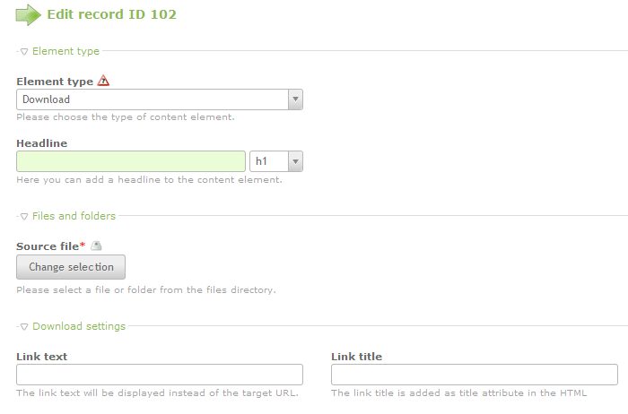
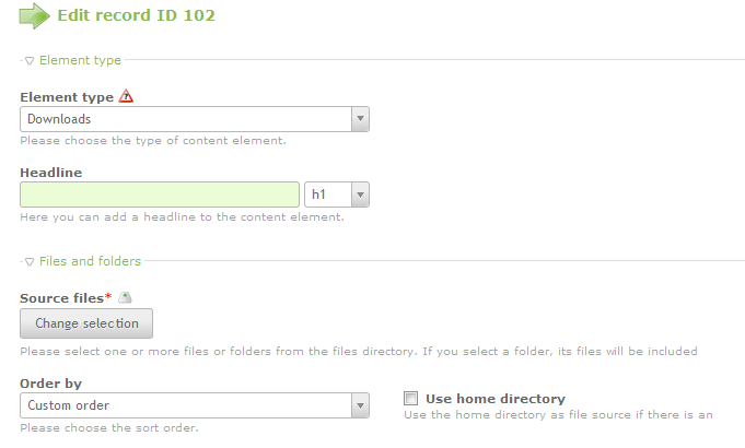
File Elements
This element type lets you set download or multiple downloads for a user.
Download - used to allow a single file download. The options include the option set link text and a link title. Here's a screenshot of the option as it is selected:
Downloads - allows you to set multiple file downloads. The downloads can be ordered using an Order by option. You can also set the home directory as the file source as long you have an verified user logged in. These options are seen below:
Include Elements
The include elements allow you to select an article, content element, form, module, article teaser or comments from an existing page in the Contao CMS.
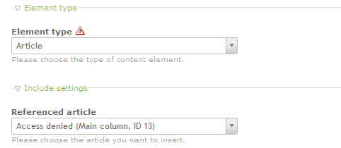
Article- include a specific article that may have been written in another section of the Contao CMS. Here's a screenshot that shows what you will see when selecting this option:
Content Element- allows you to select content already created on the Contao website and insert it into this article element. The options allow you choose any element in the site by using a drop-down menu, and set up formatting using CSS ID/classes or specific spacing before or after the element. The following screen shot shows what you would see: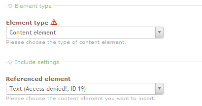
Form - Select a form generated within Contao and include it as part of the article. Here's a screenshot the shows the form option within the interface: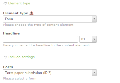
Module - Insert an existing module from Contao installation. The existing modules are available via a drop-down menu as shown in the screenshot below: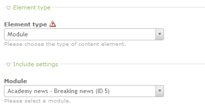
Article teaser - adds previously created article teasers to the article. The interface allows you to select the article teaser and also includes the edit icon (resembling a pencil) that will allow you to edit the article teaser you have selected. Here's the screenshot for this option: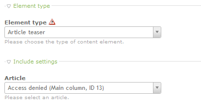
Comments - Allows you to create a comments section for the article. The settings for this section include a headline to label the area, a sort option, the ability to limit the number of comments per page, a requirement for moderation, the option to allow/disallow BBCode, a requirement to login in order to comment, and checkbox to disable the security question. You can also format the comments using an existing template. Here's a screenshot showing how these options appear when the element type is selected: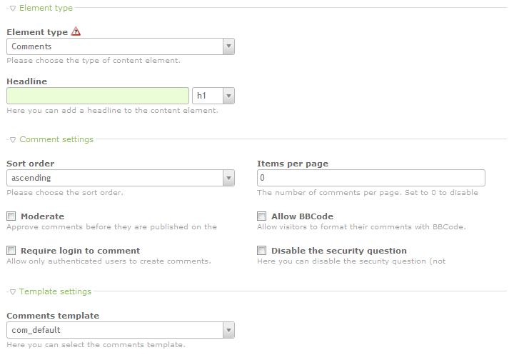
As you can see, the element types that you can select are wide and varied. As you become familiar with the interface, you can see the control that the interface enables over the elements that you add. Each option is also quickly removed or limited so that only the required users can see or use the option. Use the different element types to fill your website with relevant content that can be easily viewed and managed using the Contao interface. For further information on creating new article IDs and Article Elements, see: Creating New Article IDs and Creating New Content Elements in the Contao CMS.
Did you find this article helpful?
Tweet
Category
Creating Content with Contao
Comments

n/a Points
|
2014-10-06 10:46 am
Thanks for writing this insightful technical. |
Help Center Login
Creating Content with Contao
Related Questions
Here are a few questions related to this article that our customers have asked:
Ooops! It looks like there are no questions about this page.
Would you like to ask a question about this page? If so, click the button below!

We value your feedback!
There is a step or detail missing from the instructions.
The information is incorrect or out-of-date.
It does not resolve the question/problem I have.
new! - Enter your name and email address above and we will post your feedback in the comments on this page!